I start preventing accidental taps with larger touch targets: at least 44 × 44 points on iOS and 48 × 48 dp for Material Design. Then I check spacing and placement - not just how the buttons look.
My checklist covers five steps:
- Size and spacing: Add padding around small icons, keep touch areas from overlapping, and separate destructive actions from routine controls.
- Safe placement: Keep frequent actions within thumb reach and away from screen-edge gestures and scroll paths.
- Confirmation: Add a deliberate checkpoint for costly or irreversible actions, with labels that explain the outcome.
- Clear states: Explain why an action is unavailable, show when a request is loading, and block duplicate submissions.
- Recovery and testing: Offer Undo only when it restores the full previous state. Test controls and recovery on physical devices, including mobile and in-app browsers, with accessibility checks.
My goal is simple: <u>make the intended tap easy and a mistaken tap harmless</u>.
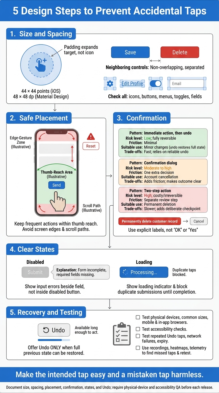
5 Design Steps to Prevent Accidental Taps
3 UI Mistakes Destroying Your App's Usability #shorts
sbb-itb-c53a83b
Make Touch Targets Larger
Start with size. If a control is too small, spacing and placement won’t solve the problem.
Set Minimum Touch Target Sizes
Use 44 × 44 points on iOS and 48 × 48 dp for Material Design as minimum touch target sizes. Document both size and spacing rules in the style guide.
For small icons, add padding rather than enlarging the icon itself. Make sure neighboring touch areas don’t overlap.
Check every interactive control, not just primary buttons. That includes icons, text buttons, menu items, toggles, and form fields.
Test Touch Targets on Physical Devices
Test the implemented controls on physical devices across common screen sizes and mobile browsers. Include in-app browsers in QA, too - they can behave differently from standard browsers.
Use session recordings and heatmaps to find repeated missed taps, then retest the updated controls.
If taps still miss after resizing, move the controls farther apart.
Space Controls Apart and Place Buttons Safely
Once touch targets are large enough, spacing is the next line of defense against accidental taps.
Keep Destructive Actions Away From Routine Controls
Leave clear gaps between nearby touch targets, and define those gaps in your design system.
Keep destructive controls separate from frequently tapped actions, scroll paths, and areas where users move their fingers often. Give these controls a distinct visual treatment so users can tell them apart from routine actions.
Test on physical devices to confirm that touch targets don’t overlap.
Check Reach, Screen Edges, and Scrolling
Place frequently used controls within thumb reach, away from screen-edge gestures and scroll paths.
During device testing, check that scrolling past a control doesn’t trigger it. If spacing alone still leaves room for accidental taps, confirmation is the next safeguard.
Confirm High-Risk Actions
After improving target size, spacing, and placement, add confirmation where a stray tap could cause irreversible damage or costly mistakes. Keep reversible tasks simple, and use the lightest safeguard that fits the risk.
Choose Confirmation Based on Risk
Weigh reversibility, financial impact, sensitivity, and workflow disruption. Match the safeguard to the task.
| Pattern | Risk level | Friction | Suitable use | Trade-offs |
|---|---|---|---|---|
| Immediate action, then undo | Low; fully reversible | Minimal | Minor changes that undo fully reverses | Fast, but relies on reliable undo |
| Confirmation dialog | Moderate to high | One extra decision | Account cancellation | Adds friction, but makes the outcome clear |
| Two-step action | High; costly or irreversible | Separate review step | Permanent deletion | Slower, but adds a deliberate checkpoint |
Explain What the Action Will Do
When confirmation is needed, make the outcome clear. Before users commit, explain what the action affects and what happens next.
For cancellation, state when access ends and what follows.
Use descriptive, high-contrast labels.
Use “Permanently delete customer record” instead of “OK” or “Yes.”
Don't assume users already understand the action.
Place the approval button away from the control that starts the action. This prevents a repeated tap from accidentally approving it. Give high-risk actions a separate visual treatment, such as a different button color.
If a control still invites mistakes, make its disabled and loading states just as clear.
Make Disabled and Loading States Clear
After a tap starts an action, the button should clearly show what’s happening. Disabled and loading states mean different things: disabled means the action is unavailable; loading means the request has already started. They shouldn’t look the same.
Explain Why a Control Is Disabled
Disabled controls should prevent taps without leaving users guessing. Disable an action only when it can’t run yet. Explain why beside the control, and tell users what needs to change before they can use it.
If an input is invalid, show the error beside the field - not inside the disabled button. Make this guidance accessible to screen reader users, too.
Block Duplicate Submissions
As soon as a request starts, change the button label or show a loading indicator. Keep that feedback visible until the request finishes so users know the action is in progress and don’t submit it again.
If the action can be reversed, offer an undo option after it completes.
Offer Undo and Test Recovery
When prevention fails, recovery must be immediate. Prevent accidental taps where possible, and make their effects easy to reverse when they happen.
Use Undo for reversible actions. Don’t promise recovery if an action can’t be fully reversed. For external sends, offer Undo ONLY if you can restore the full previous state.
Use Undo to Restore the Previous State
Make Undo visible, easy to tap, and available long enough for users to act. It should restore the full previous state, not just part of it.
Test repeated Undo taps, network failures, and what happens when the Undo window expires. Once the control is visible and works reliably, check whether users can reach it before that window closes.
Audit Recovery Controls
Check the Undo control, its placement, and its timeout on physical devices. Test recovery across devices and browsers, including in-app browsers. These can behave differently from standard mobile browsers.
Use heatmaps and session telemetry to spot repeated missed taps near recovery controls.
Conclusion: Prevent Mistakes and Make Recovery Easy
Make tap-prevention rules part of your release standards. Document touch target size, spacing, placement, confirmation, disabled and loading states, and Undo. Require QA on physical devices for mobile and embedded browsers, including accessibility checks, before each release.
FAQs
How much spacing should I leave between buttons?
Set consistent spacing between buttons and other interactive elements in your style guide. The exact pixel values will depend on your design system. Leave enough room for touch targets across devices so users don’t tap the wrong element by accident.
Growth Shuttle recommends testing different button placements and designs to improve engagement and reduce errors. Test across devices and browsers to check that spacing works as intended and stays accessible.
When should I use confirmation instead of Undo?
Use confirmation instead of Undo when an action carries high risk, is hard to reverse reliably, or has lasting effects outside the interface. Examples include permanently deleting data, changing permissions, or sending messages.
Undo can give users a false sense of safety in these cases. Require an explicit “Are you sure?” step to guard against accidental taps.
For lower-risk actions that are quick and reliable to reverse, Undo is the better choice.
How can I prevent repeat taps after a failed request?
Disable the button after the first tap and keep it disabled while the request is in progress or after it fails. This prevents duplicate actions.
Show a clear status indicator or error message so users know what’s happening and are less likely to tap again. These steps keep the user experience stable and reduce friction in your conversion funnels.